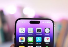
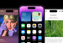
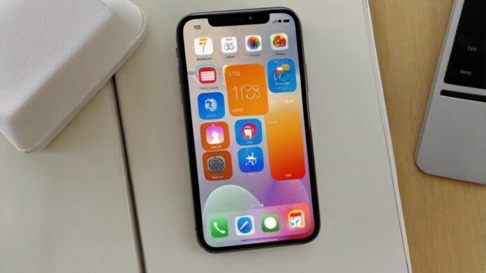
The control center hasn’t changed much in recent years, and the few changes made over the course of iOS releases haven’t helped organize it better. iOS 18 restores everything with a new interface and options to create a control center in your hands!
The function that gives the buttons
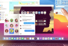
You can finally rearrange the various buttons, icons, and shortcuts in Control Center in iOS 18 and iPadOS 18. The panel, which is still displayed by swiping down from the right side of the screen (which was never an intuitive gesture, sadly), now allows for all sorts of edits.
By tapping the little extra in the top left, or holding your finger on the screen, you can simply delete an icon or move it. Even better: some of the buttons and widgets can be expanded by pulling the handle in the corner. Very useful for the Home widget or audio player, which get access and additional shortcuts.
The Control Center is organized into large sections: Favorite Buttons, Audio/AirPlay Player, Home Automation Controls, Cellular Controls, and Wi-Fi. Nothing prevents you from creating more panels to fill them with new icons and widgets. You then have a gallery that groups all the available commands, organized by section. There are so many of them that one search engine isn’t too much! And developers will also be able to offer their own controls…
Nowadays in the hotbutton department, you can finally (FINALLY!) change the two buttons at the bottom of the lock screen. The choice is made when customizing this screen. Then simply select the position, left or right, and then choose the order you want. Some of them will require authentication before launch. These new controls will also be accessible with the iPhone 15 Pro’s action button.


